WHAT A PATCH SAYS BEFORE YOU DO
What readiness symbols communicate, how people read them, and what they ask of the wearer
Author’s Note: This article reflects the writer’s observations and opinions about symbolism in readiness and preparedness communities. It is not directed at any particular person or organization, nor does it claim that every viewer will interpret a symbol in the same way. The Bobby Bama Brigade patch is discussed as a working example, not as a model that other organizations should follow.
Bobby Bama Brigade
A patch is small, but it is not neutral.
Once somebody chooses to wear a patch, it begins doing more than decorating a jacket, cap, vest, or bag. It identifies a person with an idea. It reminds the wearer of a standard. It also gives everyone else a quick impression of what that person or group values.
That impression forms fast. Most people will not stop and study every line. They will notice the largest shape, the brightest color, the words they can read, and the objects they already recognize. Then they will fill in the rest from experience.
This question came up while revisiting a Bobby Bama Brigade patch concept. What began as a color and layout discussion exposed a larger issue: the meaning intended by the designer is not always the meaning received by the viewer. That is not a reason to avoid strong symbols. It is a reason to use them deliberately.
This is not an argument for one approved style of readiness patch, and it is not a judgment on everyone who wears a different one. It is a practical examination of what patches do, why certain designs feel clear while others feel confused, and how a symbol can support a standard without trying to replace it.
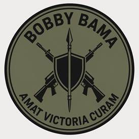
Figure 1. The original working patch concept. The shield is central, the weapons sit behind it, and the motto is intended to place preparation above force.
A patch is a compressed message
A patch usually does three jobs at the same time.
First, it identifies. It tells people that the wearer belongs to a unit, club, profession, community, cause, or tradition. That sense of belonging can be useful. Shared symbols help people recognize one another and remember that they are part of something larger than themselves.
Second, it reminds. A serious patch can serve as a small internal standard: stay alert, do the work, protect others, keep learning, be dependable. In that sense, the patch is not only speaking outward. It is also speaking back to the person wearing it.
Third, it signals. The public may read competence, service, vigilance, independence, aggression, fear, history, or responsibility into the same design. Those readings may be incomplete, but they are still real. A symbol becomes public language the moment it is displayed.
A patch says three things at once: This is who we are. This is what we value. This is what others may reasonably expect from us.
The psychology is not mysterious. People make quick judgments from familiar cues. A shield is commonly read as protection. A flame suggests light, knowledge, or vigilance. A rifle is visually louder and may be read as capability, defense, threat, or identity depending on the setting. The viewer rarely begins with the designer’s explanation. The viewer begins with the image.
Visual hierarchy works like sentence order. The object that is largest, brightest, or closest to the center becomes the subject. Everything else becomes support. If the weapons dominate the patch, they become the first message even when the written explanation says they are only a last resort. If a shield or service symbol clearly dominates, the same weapons can read as protected capability held in reserve.
There is also an inward effect. People often wear symbols that describe not only who they are, but who they intend to be. That can be healthy when the symbol calls the wearer toward discipline and responsibility. It becomes empty when the image is allowed to stand in for the work.
The symbols - and the baggage they bring
No common readiness symbol carries one fixed meaning. Each arrives with a range of associations, and the rest of the design determines which association comes forward. Placement, color, size, historical setting, and the words around the image all matter.
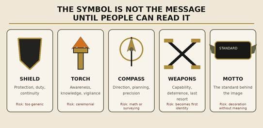
Figure 2. Familiar symbols may be useful, but each one can pull a design toward an unintended meaning if the surrounding context is weak.
The shield. A shield is one of the clearest symbols available. It usually suggests protection, duty, continuity, and defense. It tells the viewer that something is being guarded. Its weakness is that it can become generic unless the rest of the design shows what kind of protection or responsibility is meant.
The torch or lantern. These commonly suggest awareness, knowledge, vigilance, and the ability to see what is coming. They fit education, intelligence, communications, and public-service themes. Depending on the style, they can also feel ceremonial or academic. The symbol needs enough practical context to keep it grounded.
The compass. A navigation compass can suggest direction and staying on course. A drafting compass may suggest planning, precision, engineering, surveying, or mathematics. That can be exactly right for a technical organization and completely wrong for a general audience. A specialized symbol is most effective when the people viewing it already share the reference.
Weapons. Weapons can represent capability, deterrence, defense, sacrifice, history, or last-resort force. They can also become the whole identity because they are strong, familiar shapes. The question is not simply whether a weapon belongs. The question is what position it holds in the visual order.
Crossed objects. Crossed rifles, axes, tools, paddles, keys, or signal flags often show a combined function or shared profession. They add immediate structure and energy. They also create clutter quickly. If the objects come from different time periods or represent unrelated ideas, the viewer may spend more time solving the picture than understanding it.
Skulls, gas masks, distressed flags, and hazard imagery. These can communicate mortality, danger, harsh conditions, resistance, or survival. They may be appropriate in a specific occupational or historical context. In a general readiness setting, however, they often become the emotional center of the patch. The result may feel more apocalyptic or confrontational than the organization intended.
The motto. The motto is not filler around the edge. It tells the viewer how to interpret the picture and tells the wearer what standard the image is supposed to serve. When Latin or another traditional language is used, a clear English rendering can remove guesswork. For this working concept, the chosen operating meaning of Amat Victoria Curam is “Victory Loves Preparation.”
None of these are verdicts. They are likely readings. A symbol may carry a deeply personal or historical meaning that an outsider does not see. The practical question is whether the public meaning and the private meaning can live together without the design becoming misleading.
Weapons: capability without making it the whole identity
Readiness communities sometimes treat weapon imagery as automatically necessary, while critics may treat it as automatically disqualifying. Both positions skip the more useful question: What is the weapon being asked to say?
In the BBB patch discussion, the weapons were meant to communicate a specific order of thought, not a fascination with force:
1. Preparation first
2. Discipline and foresight
3. Capability if circumstances deteriorate
4. Last resort, not first identity
That is not merely a disclaimer added after the design. It is the intended hierarchy of the design. If the weapons are the brightest, largest, or most detailed objects, the patch contradicts that hierarchy. If they are placed behind the shield, reduced in contrast, and kept clear of the name and motto, they can read as a contingency rather than the main identity.
The treatment of time periods matters too. A spear beside a modern rifle may be intended to show continuity across history: people have always had to protect what matters. Some viewers will understand that. Others will simply see two unrelated eras. Replacing the spear with a Revolutionary War musket may narrow the gap, but it does not automatically solve the problem. It introduces another historical statement that the design must be prepared to explain.
There are three clean choices. Use weapons from the same period. Use one abstract symbol of capability rather than several literal ones. Or make the historical range an unmistakable part of the theme. What usually fails is an accidental mixture that asks the viewer to invent the connection.
The point is not to erase hard capability from the meaning of preparedness. Real preparedness includes uncomfortable possibilities. The point is to place capability in the right order: available, disciplined, and subordinate to judgment, responsibility, and prevention.
Color changes the emotional temperature
The same shapes can tell a different story when the colors change. Olive drab and black suggest utility, restraint, and a field-oriented purpose. Black and antique gold suggest tradition, permanence, and authority. Used carefully, they can look serious. Used too heavily, they can make an embroidered patch resemble a polished challenge coin.
Red can signal courage, urgency, sacrifice, danger, or warning. Orange often suggests visibility and safety. Blue can suggest calm, trust, public service, or communications. White creates contrast and clarity but also makes a patch more visible. Full color is not automatically less serious, and subdued color is not automatically more authentic. The colors have to support the intended use.
There is also a production reality. A digital rendering can show fine metal, shadows, texture, tiny lettering, and several shades of black. Thread cannot reproduce all of that cleanly on a small circle. Fine lines close up. Dark shapes merge. Narrow letters become unreadable. A design that looks impressive on a phone may become a dark knot when embroidered.
The useful test is to reduce the image to the size it will actually be worn and view it from a few steps away. What remains visible is the real hierarchy. If only the rifles remain, the rifles are the message. If the shield and motto remain clear while the weapons recede, the design is closer to the intended order.
A useful failure: when private meaning becomes public confusion
One of the cleaner concepts tested during the design discussion used a shield, a torch, and a drafting compass. Inside the conversation, the symbolism was clear. The torch represented awareness. The compass represented planning, precision, and an engineering mindset.
The immediate reaction from outside that explanation was much simpler: “I hate math.”
That was not a failure of intelligence or taste. It was useful information. The symbol was being read through a more common association than the one intended. The design had asked the viewer to know too much about the person behind it.
That is the difference between intended meaning and received meaning. Designers naturally see the story behind every object. Everyone else sees the object first. A symbol can carry a private layer, but the main message should not depend on private knowledge to make sense.
The same rule applies to mottos. A Latin phrase may add history, continuity, and weight, but it may also leave most readers guessing. Pairing it with a stable English line can solve that problem. In this case, “Victory Loves Preparation” states the operating meaning plainly. Once that wording is chosen, it should remain consistent across the patch, article, and explanation.
Seven tests before approving a readiness patch
1. The stranger test. Show the design to someone who does not know the backstory. Ask what they think it means before explaining it. The first answer is not automatically correct, but it tells you what the patch communicates without assistance.
2. The hierarchy test. Name the first three things the eye notices. That order is the patch’s real sentence. Compare it with the values the group says come first.
3. The plain-language test. Explain the patch in one ordinary sentence. If the explanation requires a long defense of every object, the design may be carrying too many ideas.
4. The consistency test. Check the time periods, artistic styles, and levels of detail. Every contrast should look intentional. Accidental differences create visual noise and invite meanings that were never planned.
5. The thread test. Shrink it to actual size and imagine it made from a limited number of thread colors. Remove anything that disappears, touches the lettering, or turns into an unidentified shape.
6. The conduct test. Ask what behavior the symbol implies. Would the wearer be comfortable explaining the responsibilities that come with it? A patch is strongest when the conduct behind it can carry the same message without the patch.
7. The longevity test. Consider whether the design will still make sense after the current trend, crisis, piece of equipment, or online style has passed. Durable symbols usually depend on durable principles.
What a good patch should ask of the wearer
A patch is not a credential. It does not prove skill, courage, judgment, or readiness. It cannot show whether the radio batteries are charged, the medical training is current, the plan has been practiced, the supplies have been rotated, or the person wearing it can remain calm when events stop going according to plan.
What it can do is point back toward that invisible work. It can remind the wearer that preparation is deliberate, protection carries responsibility, and capability should be built quietly before it is ever needed. It can show that serious people are willing to consider difficult possibilities without making those possibilities the center of their identity.
That may be the most useful distinction in the entire discussion. The patch should not ask the public to admire the wearer. It should ask the wearer to live up to the standard.
A good readiness patch does not promise that the wearer is prepared. It reminds the wearer to keep preparing.
That is what gives “Victory Loves Preparation” its weight. The phrase is not a guarantee of victory, and the patch is not a claim of superiority. It is a reminder that better outcomes usually begin long before the difficult moment arrives - in planning, maintenance, training, judgment, restraint, and the willingness to think ahead.
A symbol cannot do that work for us. It can only keep the work in view.
Victory loves preparation.
Gives one a lot to think about. Great information. Now im wondering if I might need to re think my patches